Dekmantel
Festival São Paulo 2018
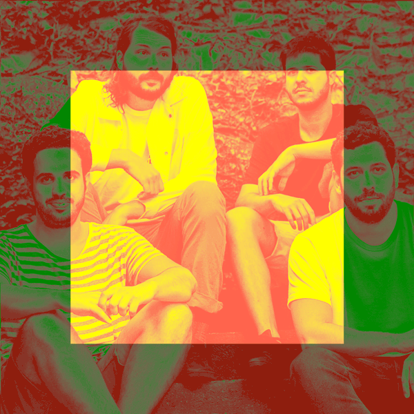
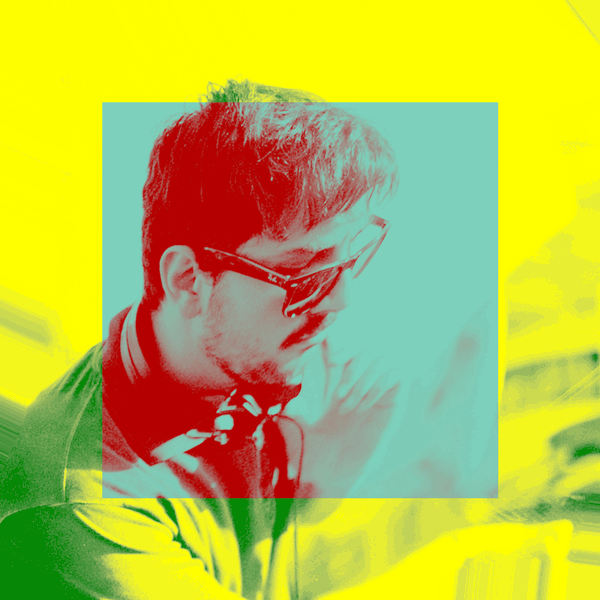
The festival style of 2017 took its inspiration from the curvaceous brazilian buildings designed by Oscar Niemeyer. This year, the concrete is evolving back to nature, calling to mind the jungle and the many bodies of water surrounding São Paulo. The flowing graphics are challenging the recognizable shape of the already existing Dekmantel square. The liquid images are paired with bold typography to keep things grounded and use a vibrant color palette for a festive, hot and tropical atmosphere.
The identity is used for festival site materials, such as flags, maps and signposts, but is mostly an online campaign directed at their international social following.
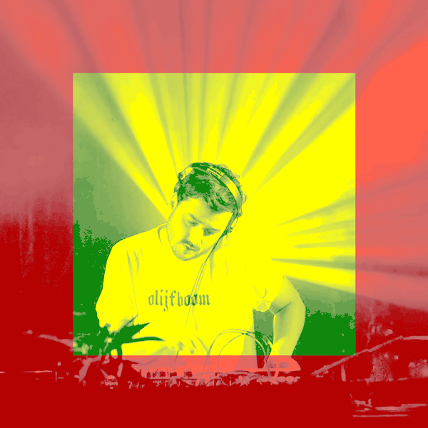
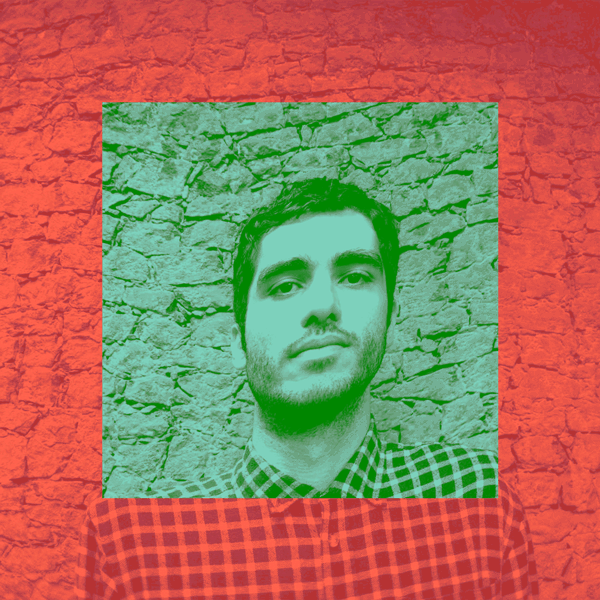
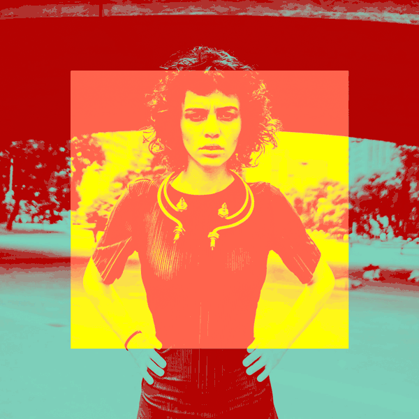
Dekmantel is a Amsterdam based versatile music organization that releases cutting-edge dance music and is also a festival well appreciated for its deep and genuine passion for underground dance music.


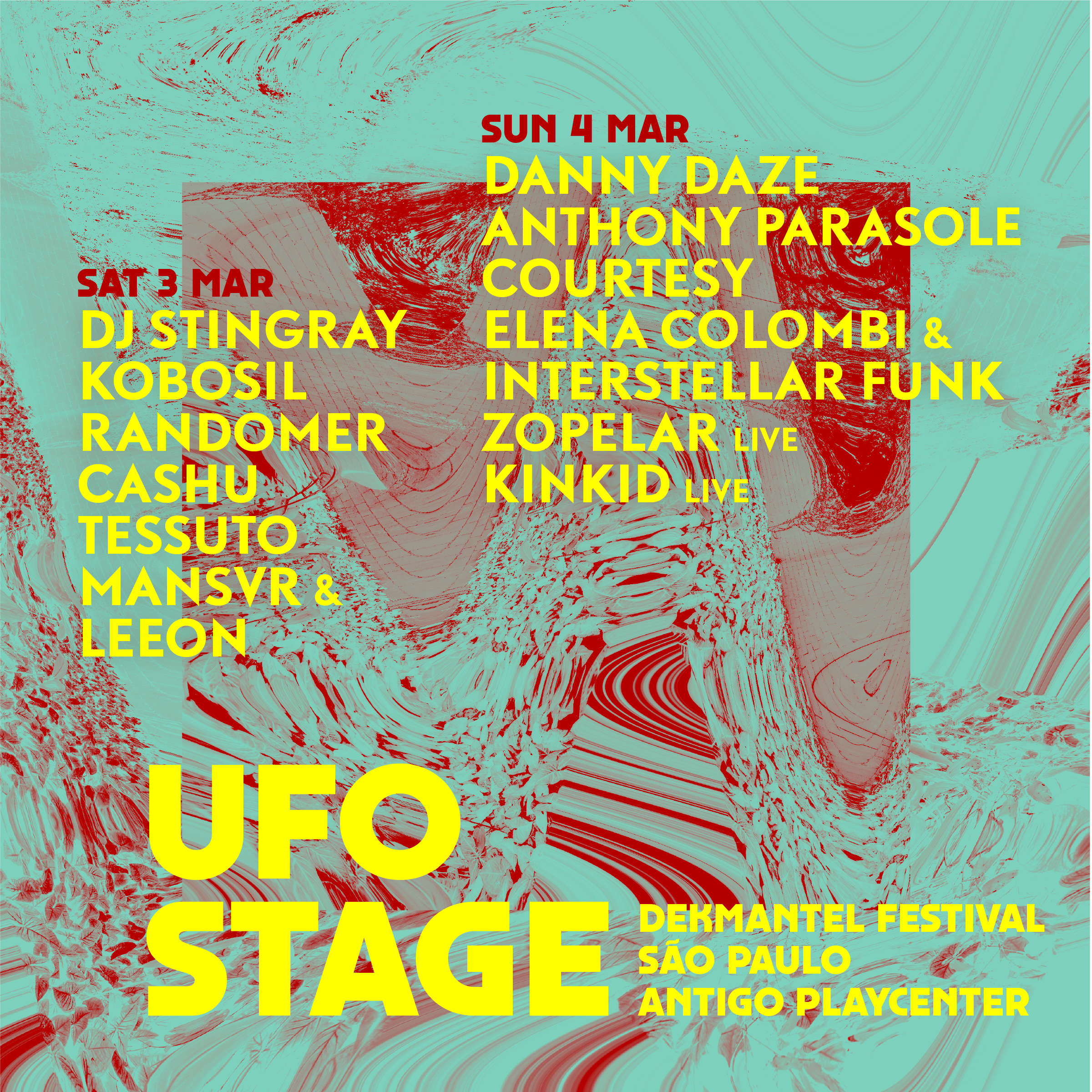


Several social media posts to announce artists and stage line ups. Because of their worldwide following, the online presence of Dekmantel is key.


Web development by Bravoure. Original Dekmantel font by Orpheu de Jong, revamped by Paul van der Laan.


"Curves are the essence of my work because they are the essence of Brazil"
– Oscar Niemeyer, architect